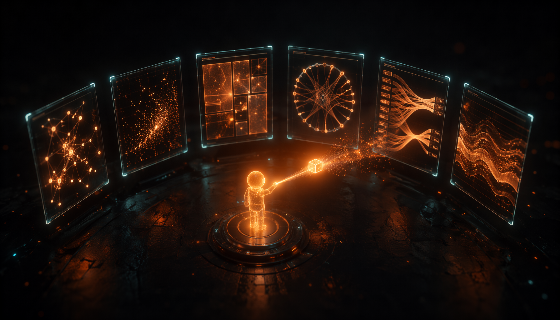
I've spent four posts describing the pks brain. Why it exists, what it produces, that it was a graph all along, and how it writes commit messages. All of it words about data I'd never actually seen.
This post is where you see it. Six small demos — each a self-contained HTML page, no frameworks, no backend — that read the same raw event logs (the "firehoses", as the code calls them) the series has been talking about and each render one facet. They're live at /brain-lab.
Two things drove the curiosity: Karpathy's "LLM Wiki" idea of an agent maintaining its own cross-linked knowledge base, and Google's brain-inspired memory work (Nested Learning). Both are about giving an agent's memory a shape. Brain Lab is just that question asked visually: if the brain has a shape — what does it look like?
An honest note before we start. The numbers are real, pulled straight from the brain — but scrubbed of names, secrets and internal paths before going public. And when a demo shows a dollar figure, it's the extract cost — what it cost to summarize the sessions (haiku/Foundry), not what the work itself cost.
1 — The Memory Brain
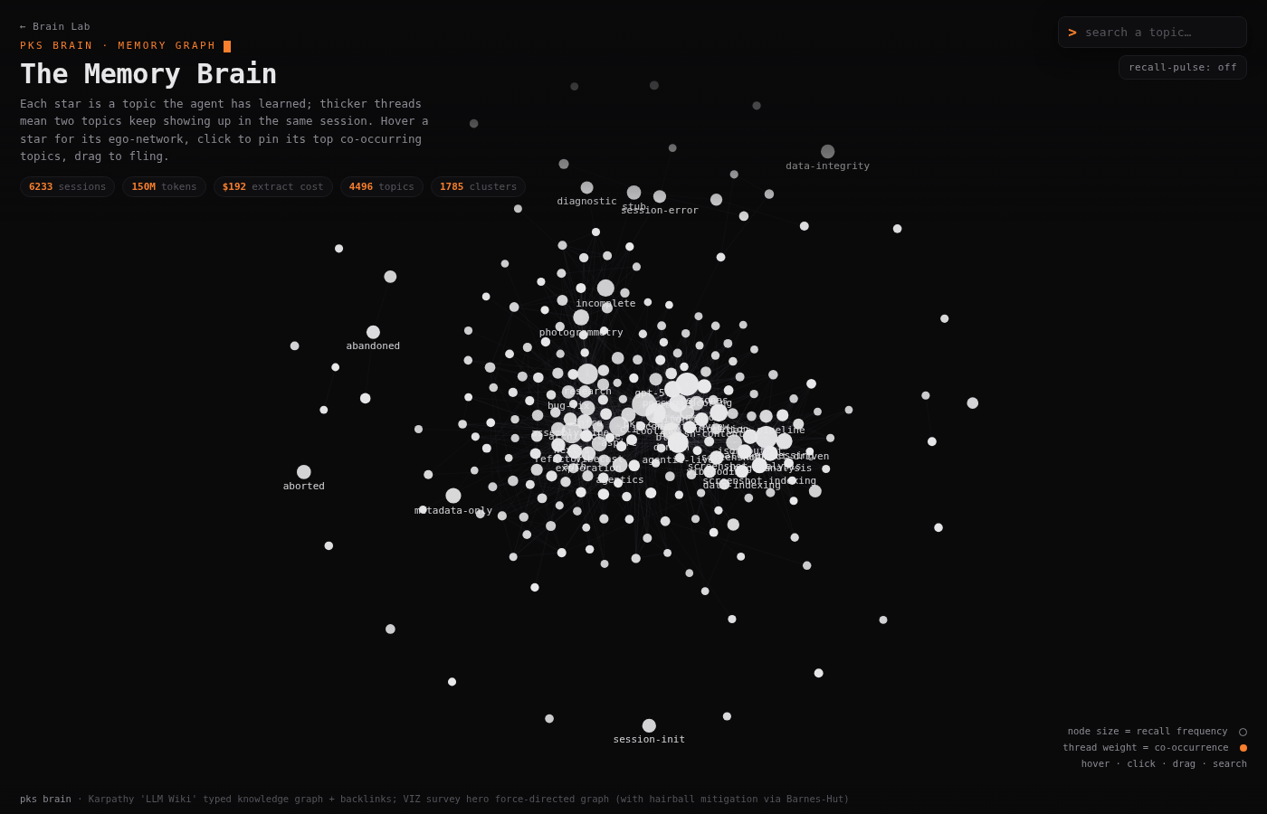
The brain's vocabulary as a force-directed graph. Every star is a topic the agent has learned; the thread between two topics thickens the more often they show up in the same session. The hubs — nextjs, aspire, pks-cli — pull into the center. Hover a star for its ego-network.
2 — Session Galaxy
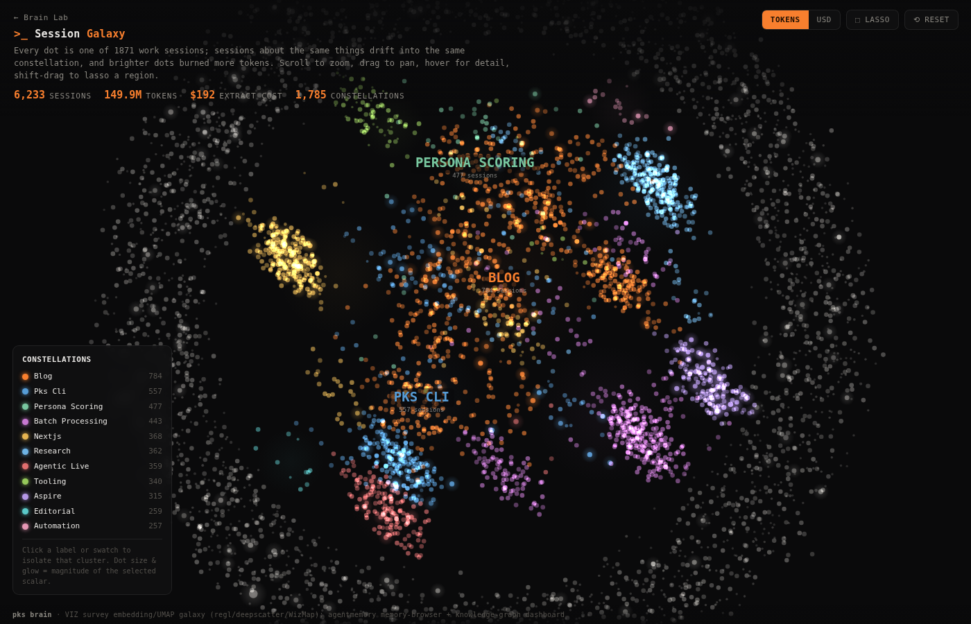
Every session is a star, placed by its tag fingerprint so sessions about the same things drift into the same constellation — colored by model, sized by tokens. This is the episodic layer: months of work as a night sky.
3 — Where the Tokens Went
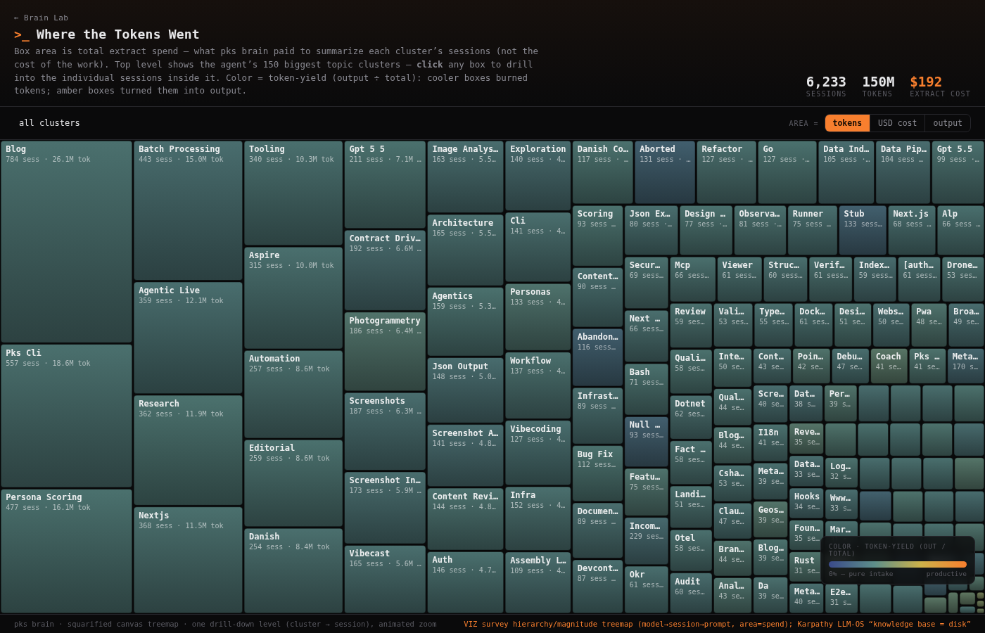
A treemap where box area is total extract cost per topic cluster — i.e. where the brain's summarization budget went. Click a box to drill into the individual sessions inside it.
4 — What Travels Together
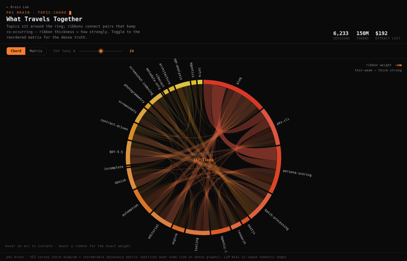
The same co-occurrence data as The Memory Brain, but as a chord diagram — and a reorderable adjacency matrix for when the graph gets too dense to read. (Matrices beat node-link diagrams on dense graphs; that's the whole point of the toggle.)
5 — The Pipeline Graph
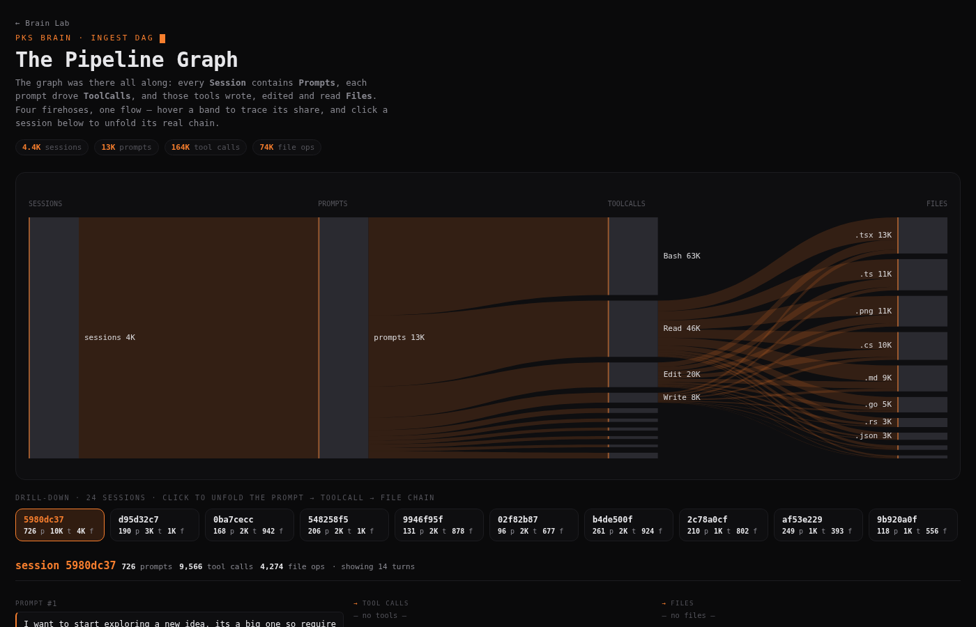
This is the living version of the DAG diagram from the third post. A Sankey of the four layers — Session → Prompt → ToolCall → File — in their actual proportions, with a drill-down: click a session and its real chain of prompts, tool calls and touched files unfolds below. The graph was there all along; now you can touch it.
6 — The Heartbeat
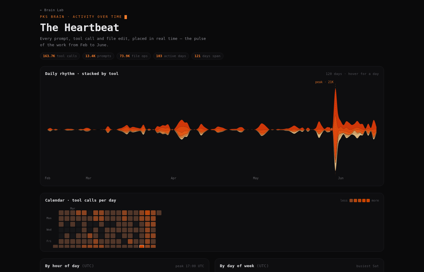
The first demo that uses the real time axis from the raw event logs. A streamgraph of activity day by day (Feb→June), a GitHub-style calendar heatmap, and the rhythm across the hours. It looks like a cardiogram — because it is one. The May 30 spike is unmistakable.
Why six
Because the brain doesn't have one shape. It's a relational web (1, 4), an episodic landscape (2), a ledger (3), a typed DAG (5) and a pulse (6) — all at once. Drawing it six ways isn't decoration; it's the only way to capture that the same data is several things simultaneously.
All six read the same prompts.jsonl / tools.jsonl / files.jsonl + extract sidecars the rest of the series describes. No backend, no build step — just a deterministic export and a bit of canvas. The gallery ties them together: /brain-lab.